Tuesday 10 May 2011

Re-post of final work


Below is the final trailer along with the two ancillary tasks.

ANCILLARY TASK ONE: MAGAZINE COVER:


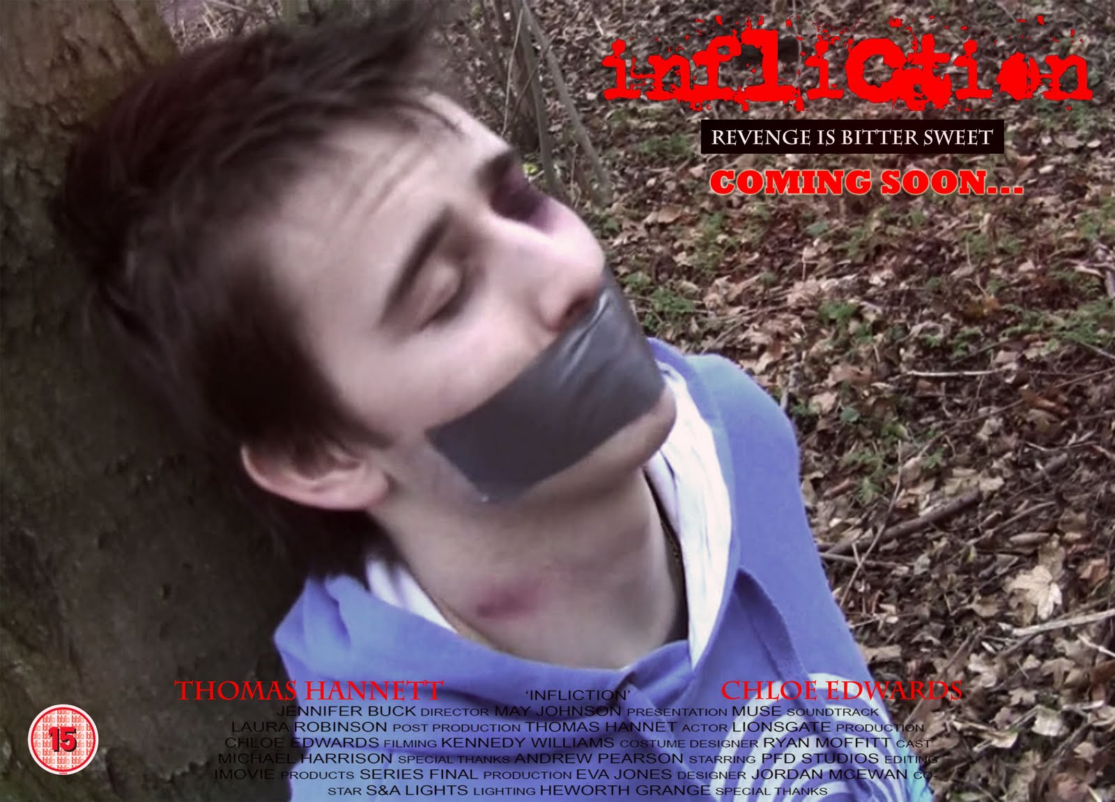
ANCILLARY TASK TWO: POSTER:


FINAL PRODUCT - TRAILER:
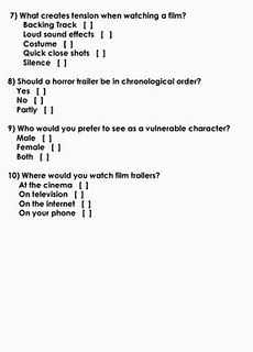


For a better quality video please visit the link below:


http://www.youtube.com/watch?v=33rIAKNJpRc

Wednesday 4 May 2011

How did you use media technologies in the construction and research, planning and evaluation stages?

After looking back at last years blog we decided that it was way to text heavy, especially in the evaluation section. To overcome this we have decided to add a video response to this particular question. By doing this we learnt many more skills, such as how to pic up sound successfully, this was relevant because our trailer itself did not actually have any dialogue in it. By making a video response instead of writing a formal essay, we created a media project within a media project. By this I mean that the whole process of filming our response was like a project within itself and was a lot more challenging then making an essay, but a lot more rewarding. It is much easier to watch and listen then to reed and reed through work. Below is our response to the question given in the title, and it is a good explanation of why we did not include any dialogue in our trailer:


The above video is over 30 minutes long which means it is very big in size. As blogger only allows certain size videos to be uploaded we had to have the video reduced in size in order to show all of the quality in the video. The downside to this is that the sound, as well as visual quality of the video has been reduced. This is the reason in which the sound is slightly off.

The origional larger sized film which is of much better quality can be found by following the link below

http://www.youtube.com/watch?v=BN36zp0ao4U&feature=channel_video_title

What have you learned from your audience feedback?

In order to get the best possible response we screened out film to the target audience and then filmed their responses.


Overall we received very positive responses from the audience and took onboard what they had to say. The main thing that needed changed was the last shot which was too long. As well as this a majority of people said that it would be better if the sound had ended before the final text cards. So I went back the raw product and shortened the final shot and fade the music out slightly earlier.

Without the audience feedback none of us would have thought to do this, but in carrying out the modifications suggested we have created a much stronger product.


Questionnaire

After handing out our questionnaires to a random sample of the target audience we took them back in and went through them to see what our findings were. Overall we found that our trailer was liked and would be seen by most of the target audience.


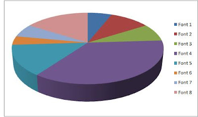
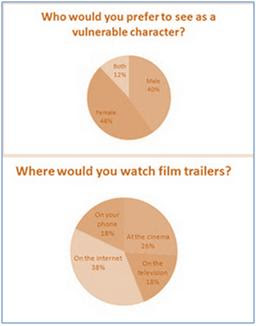
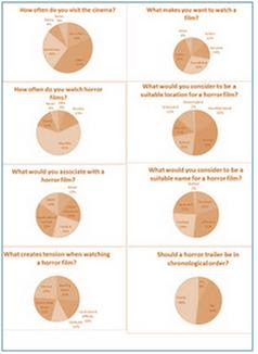
As well as generic questions we also gave the audience a specific question. In the pie carts below the copy of the questionnaire, pie number five represents the answer the question I asked the audience 'What do you think of the use of locations and props within the trailer'


Below is a copy of the questionnaires we handed to the audience.


Results:


For the questionnaire we used a mixture of open and closed questions. The main reason for this was so we were able to show some findings in the form of pie charts as well as being able to receive feedback from people. As the pie charts above show, our trailer was well liked by the audience it was shown to. The open questions were very useful and the main thing we found was that the last shot could benefit from being made shorter. With this knowledge we then went back to the drawing boards to make some final adjustments.

As well as this we found out that most of the audience we asked would prefer the music to end before the final credits. We also made these adjustments to the trailer in order to further satisfy the audience.


Overall I feel that the audience feedback session went very well and help us to make some very good final adjustments to our trailer

In what ways does your media product use, develop or challenge forms and conventions of real media products?


As well as the theories mentioned above, i also found some quotes which can be related to our trailer.


John Fiske (1988) ‘attempts to structure some order into the wide range of texts and meanings that circulate in our culture for the convenience of both producers and audiences’


This quote relates the theory provided by Todarov as it relates to different stages within a piece of media, in this case the horror trailer. And as i have shown above our trailer does not follow the conventional steps to a trailer, but it does include them. This enables the audience to understand the media text but at the same time as being slightly confused

How effective is the combination of your main product and ancillary tasks?

I feel that as individual products my work is very good but not strong. However, if you combine together the magazine cover and poster with the actual trailer you find that they all complement each other well and help to create a real looking product which refelects both the genre and mise en scene of horror. The horror trailer alone I feel is a strong piece of work, but when combined with the poster and magazine cover it is somewhat supported. The main fact that I realised when completing all of my work is that, although it is the main part of the overall task, the trailer is almost nothing without the two supporting pieces of work, most importantly the poster. As I found out during the research section of my coursework I discovered that almost every trailer does indeed have an accompanying poster.


The main product can be shown in a variety of places on the internet, but the poster and magazine will be able to be seen in shops, on billboards, on bus stops, in shop windows, on trains (below) as well as being able to be found on the internet. The wider audience reached by creating print work pieces which are directly linked to the trailer maximises the possible audience by showing them a glimpse of the film without them necessarily having to be in the cinema or online.


The main product, however, is able to be shown on a multiplicity of websites which will give it a much larger audience who are able to comment and give feedback to the product itself. Websites that it could be featured on include ‘bloodydisgusting.com’ ‘YouTube’ as well as social networking sites such as Facebook and Myspace (below).


This type of advertising is called viral marketing and is a great way of advertising out final piece, especially because the target age group is 15-25. This means that most of them will have access to the internet, probably on more than one level, be it computer, laptop, mobile phone or iPod. Viral marketing is a very cheap way to advertise and, as we have no budget, it would suit our film well. The best example of viral marketing is ‘Paranormal Activity’ (below) which was involved in a massive advertising campaign in which people had to vote where the film was shown, giving the audience a very good sense of false ownership.


The main thing about being able to use a variety of websites is the fact that I have combined the process of ‘producing’ and ‘consuming’ in order to become a prosumer. This has gave me many advantages but the main one is me being able to produce a product at the same time as enjoying already existing ones, which also aided in production


By using the production name ‘Lionsgate’ we are already implying that the product will be of good quality. The main reason for this is because ‘Lionsgate’ is a reputable and international production company which is known by the consumer for being a good independent company. They have produced things such as the Saw sage and Hostel

Wednesday 13 April 2011

EVALUATION

From this post on all of the work will be in direct response to the Evaluation questions. The questions will be clearly shown in their relevant posts.

Final Piece


Here is the copy of our final piece which can also be found on youtube (http://www.youtube.com/watch?v=33rIAKNJpRc ) and is able to be put on other sites such as bloddydisguisting.com and social networking sites including facebook and twitter.


PLEASE NOTE: Because of the size of the movie it had to be shrank. this has caused the quality of the trailer to be effected. the main things that have been effected are the image quality as well as the sound track sounding tinny. For a better quality trailer visit the above youtube link

Ancillary Tasks

Ancillary task two: Poster


Below is a copy of my poster for which i used posters that i had previously anyalysed to gain the basic conventions of a movie poster, especially a horror poster. The previuse examples can be seen in a previuos post headed ' other horror trailers/posters'


Ancillary task one: Magazine Cover


Below is a copy of my magazine cover. The poster uses the current brand name of 'Total Film' as it is a well liked and recognisable label to the film enthusiast. This product was made using conventions of magazines in which I discovered last year. As well as this I discovered more conventions of film magazines when I analysed a Total Film magazine cover, this analysis can be seen on a previous post on my blog.

As I did not need to do as much research into existing products because of knowledge obtained last year I was able to complete this magazine cover in about a week and a half. As well as this, the fact that I did not have to think of a title enabled the production time of the product to be reduced drastically.

Magazine Analysis


As you can see, the above magazine is focused solely on film. This is very evident because of the title of the magazine ‘Total Film’ as well as the title of a well known film on the bottom of the magazine.

As this magazine shows, the biggest title second to the heading is the name of the feature film. In this case ‘Harry Potter’. As well as this the main model on the magazine is from the main film. The main model is instantly recognisable in as a key person from the film, in this case Harry Potter. The stance is very dominant and the consumer is looking up at him.

The background is red and black which, along with the models clothing, adds to the overall mise-en-scene of the cover, giving connotations of danger in this case.

The pull lines down the sides are always film related and the biggest is always the feature article, again associated with the main film.

where we are at

Eventually our moving image production is complete. A few delays were encountered during the final stages of post production which delayed us by a week or two, again. The print work is yet to be complete but it should be done in the next two or three weeks as I just need to add finishing touches, but as we are off for two weeks on Friday this will put me slightly behind schedule as lots of coursework deadlines are looming right now. After this post there will be purely EVALUATION as well as final work

Lionsgate

The production body we have decided to use on our trailer is Lionsgate. We chose to use the red coloured themed text card as this automatically represents horror.


The main reason we chose Lionsgate is because it is a popular and well known brand and will be instantly recognised by the horror audience and critics alike because it has already produced massive films such as the saw series and hostel.

Fonts

The following fonts were shown to the target age group in order to discover which was liked the most. The winning font was carried forward and used in the trailer as well as one other font which will be decided at a later date. The fonts are courtesy of http://www.urbanfonts.com/


The winning font is called ‘uncletypewriter’ and can be seen on the bottom left of the above photo. Below is a pie chart of which fonts were voted for by the 50 judges. The order is from top left to bottom left, and then from top right to bottom right. uncletypewriter is font number 4


Friday 25 February 2011

Music

The original plan was to use two different songs for the horror trailer. We did intend to use Bill Withers - Ain't no Sunshine when she’s gone for the start of the trailer because we felt the lyrics suited to clip very well. We then intended to play Hysteria by Muse for the harsher, faster paced torture and bully section of the trailer. However this did work quite well when we tried it, upon further research I discover another song by muse whilst on YouTube. The song we will now use is called Space Dementia and fits perfectly to our trailer. At the start is very light but slightly haunting but when the bullying starts we thought it would be appropriate for the pace to pick up and it become heavier, especially as the length of shots became shorter and the trailer gets faster paced.

Tuesday 8 February 2011

Where we are now

This is just a quick video update of exactly where we are in terms of filming (8th February 2011)


Monday 24 January 2011

Outtakes

We have almost finished filming and are in the thick of the editing of our trailer. Here is a quick glimpse to show what we have been up to:


Saturday 1 January 2011

Typical Audience

Horror is a very popular genre within film. The typical audiences tend to age from around 15 to the mid/late twenties. However as some horrors are rated 18 they are not able to be seen by persons from 15-17. Mainly for this reason we have decided to aim our horror trailer to persons 15-25.

The guidlines for a horror trailer as certified by the British Board of Film Classification (BBFC) states that the following are within bounds of a 15 rated movie:

Theme: No theme is prohibited, provided the treatment is appropriate to 15 year olds.

Language: There may be frequent use of strong language; the strongest terms are only rarely acceptable. Continued aggressive use of strong language and sexual abuse is unacceptable.

Nudity: There are no constraints on nudity in a non-sexual or educational context.

Sex: Sexual activity and nudity may be portrayed but without strong detail. The depiction of casual sex should be handled responsibly. There may be occasional strong verbal references to sexual behaviour.

Violence: Violence may be strong but may not dwell on the infliction of pain, and of injuries. Scenes of sexual violence must be discreet and brief.

Imitable techniques: Dangerous combat techniques such as ear claps, head-butts and blows to the neck are unlikely to be acceptable. There may be no emphasis on the use of easily accessible lethal weapons (in particular, knives).

Horror: Sustained or detailed infliction of pain or injury is unacceptable.

Drugs: Drug taking may be shown but clear instructive detail is unacceptable. The film as a whole must not promote or encourage drug use.
the following website contains more information on the 15 certification. http://www.screenonline.org.uk/film/id/592478/


The audiences for horror trailers have an extremely high threshold for excessive gore, mutilation, decapitation, torture and extreme violence. This has been developed over years of development of animatics and effects within the film industry. The new breed of horror films are often dubbed as “horror-porn” or “gore-nography” as they aiming to scare the audience as much as possible as well as staying in the limits of the law, often testing the limits of the American ‘R’ rated films.

Narrative and Representation

Ever since films were invented they contained scary and disturbing images. The reason for this is that people want to be and like getting scared or shocked. The need for fear is just a natural requirement for a human, it is a part of your imagination since early childhood, and it is thought that we are all born with only two fears, darkness and height. Horror movies, however, do appeal to our most primitive state which is one of the main reasons they are a very popular film genre.

Most horror films are a metaphor for most of our own lives; they often identify the victim who is trying to overcome the monster. As horror is required by the human mind it is often shown across all genres of film.

Horror films also allow us to ask the ‘what if?’ and let us safely dip into our primeval fears.

The following link contains lots of interesting information about the nature of horror film - http://www.bellaonline.com/articles/art5267.asp

Storyboards

The first set of storyboards are of the equilibrium section of our horror trailer. As well as a drawn storyboard i also created an animatic.


Conventions of Horror Trailers

I have found in my research that nearly every horror trailer has two sections; Equilibrium and Disequilibrium, but never new equilibrium. The main reason for this is the fact that there is no need to have new equilibrium within a horror. The main reason a horror is a horror is because it rarely has a new equilibrium section. If a horror were to have a new equilibrium section then the film or trailer would become positive again, which is not wanted in a horror trailer. Instead, the end of horror trailers normally leave the audience hanging in suspense, often leaving them puzzled, which is the full intention of the trailer. This can be done in a few different ways. The most popular way is the build the music in the trailer up to a climax and then stop or slow down the music, in anticipation of a large scare or haunting spook, which frightens the audience. This can be seen in the trailer for the morgue when there appears to be new equilibrium until a quick shot of a man cutting his throat appears to give the audience one last scare.


As well as this, most good trailers are fast paced when the disequilibrium starts and often contain shots of knifes plunging or flashing on the screen and weapons being thrown. This often promises the audience blood and gore, to which most people who like horrors are attracted.

Whilst I was carrying out this research I discovered many key conventions very common in nearly all horror trailers:
· The use of the name of the producers in a text card for example ‘Fox Searchlight’.
· The use of fast shots with little or very little amounts of clarity, this is very effective and leaves the viewer in suspense, leading them to want and watch the film.
· Dark lighting is very effective as most people become nervous in the dark.
· Pathetic fallacy is often used, especially the use of rain to give a gloomy feel.
· The use of rural areas is important, in our trailer especially, because if a very urban location was used the person would not seem alone and isolated.
· Text card are often used to tell information, such as the actors name which will help to endorse the film if they are well known. However they are normally used to tell a story in separate intervals between shots.
· The use of weapons and showing of blood or gore is often popular to horror audiences.
· The use of a victim.
· The editing of the piece, especially in the disequilibrium section, is very fast and often has very few transitions, which help to make it disorganised as mentioned above.
· Many horror trailers also leave the viewer in suspense with one last scare at the end after the text cards.

Other horror trailers/posters

Vacancy
The poster for this film is very good. You simply see two people who are trapped with no way out. they are purposely framed within the window to show that they are isolated. The slight distortion to the picture also gives it a good luck, for the films genre. You can also see the reflection of the motel sign in the window, which they appear to be looking at, with a very vacant expression.


Key Points from the Trailer


  • very dark lighting is used


  • the diegetic sound is very whispery, especially the dialogue


  • you can clearly see that the two people being focused on are lost and are filmed as being alone and in isolation


  • you can clearly see a realisation of the problem when the two are watching videos of people being killed in the room they are in


  • the speeds of the shots speed up at the same time as the the music, which works very well


Funny Games 
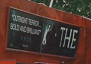
This poster is especially special. Normally you would associate white with purity and calm, but in this poster the two people wearing mainly white appear to be the 'bad guys' of the film. However, the name 'Funny Games' is in red which has connotations of blood and death. This poster also contains a review from a newspaper, to show that it has been highly rated.


Key Points from the Trailer


  • the music starts out very happy and positive and takes conventions other areas of film which would not be associated with a thriller or a horror


  • the, what we learn to be villains, are in white which is very convention breaking as the so called 'bad guys' usually dress in black as white often gives a sense of innocents


  • the music also speeds up at the same time as the shot lengths decrease


  • the text cards are red however which have connotations of blood, fear and also a sense of warning


American Psycho


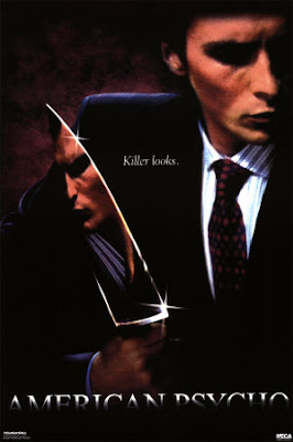
This poster is very simple and very effective. There is very little text so most of your attention is on the man within the frame. The fact that he is holding a knife instantly tells you that he is probably the person in the film who will be doing the killing. The fact that we can see his reflection in the knife tells us that he has two sides. The simplicity of putting 'killer looks.' on the poster is very effective, as it makes you wonder what it is all about.


Key Points from the Trailer


  • the use of dialogue within this trailer is very minimal and is more like we intent to have our trailer


  • the talking is chatty but in a happy tone, however what the man is saying is actually pretty sick


  • lighting is also very dark within this trailer


  • the only sound when the main piece of acting is taking place is the song, which is a happy song and does not follow what would normally be associated with a trailer


  • the main villain is often wearing white but often has red blood on his face or arms which show he is the bad person within the trailer


  • as well as this the text cards are white which also represent innocence

Locations

I feel that the locations that we film in are vital to the success of the trailer. We decided as a group that we should film in a wooded area in order to make the horror trailer scarier. Obviously we could have just chose anywhere to film, but instead I carefully selected many areas to film in. We may not use all of the areas but by having chosen more then one we can always move to another area and knowing it is acceptable to film in. It took me many weeks of continuously driving around to find suitable locations to shoot in. Most of the areas can bee seen on the map below.


This map, courtesy of Google maps, shows where we will be filming our torture scenes. Letter A upon the map is our school, at NE10 0PT. The other destinations will be used for the disequilibrium section of our horror trailer. We decided that to escape the organisation of urban life we would have to retreat to a more a more rural location, with very little around. This will be very effective when filming the disequilibrium section of our trailer.

Below is a video of locations and some of the problems we have faced:


Monday 29 November 2010

Questionnaire

We wanted to fond out what people wanted in terms of a horror film, to do this we carried out a questionnaire and got 50 people to complete them, below is what the questionnaire looks like:


After collecting and analysing all the data, i decided to show the results by using pie charts. I feel this is a very clear and efficient way to show the results as it shows which criteria is most liked in a very easy to read format. Such as the title of the film, which is going to be 'Infliction'


Sunday 14 November 2010

Analysis one

Before we started to film our trailer, i wanted to know exactly what a horror trailer is and also find some already existing trailers.

'Horror movies deliver thrills as well as telling us stories of the dark, forbidden side of life (and death). They also provide a revealing mirror image of the anxieties of their time.'

I got this information from the following website which provides lots of intresting history about horror films http://www.horrorfilmhistory.com/

The first triler i analysed was called 'The Summer House'


Mise-en-scene

Initially we see two cars driving down a road, one is bright and the other is darker, and maybe not part of the group? We then cut to a group of friends playing in a lake. This is the equilibrium of the piece. The equilibriam is very short in a horror trailer as it should mainlt be about scarying the audience, not showing the safety and happiness on the screen. We then see a girl in a red/orange top wich has connotaions of danger. The light then hits the screen and all seems well. After the first flash card the trailer gets darker, implying danger. When we see the road sine on the floor there is a bright flash, this is almost the turning point in the trailer from equilibrium to disequilibrium. Now every shot is darker and faster, making the audience feel more tense and on edge.

Sound

Withtin this trailer the sound plays a vital role. It starts of quite happy and almost cautios. the song has a very eary feel to it and is almost haunting. The fact that the sign on the floor warning them is not seen is even more implied by the sound effect added on the top. The song starts to build speed and get more intense as the camera shots speed up. As a flash card appears saying 'survive' intense drums start, making the audience evn more nervous. The haunting sound and singing stop and the music is very intense with sound effects corresponding to the shots. This builds to a climax which stops when the name of the film appears (The Summer House) and then holds on another eary and haunting climax until the trailer ends.

Camera angle shot and movement

The beggining of the trailer has a ixture of shots from close ups to extreme long shots. The length of the shots are between two and five seconds long which is resonably long, showing a sense of safety. At the point of view shot in the lake we can see that the girl is by herself looking at her friends at the edge of the lake. We then see the car in the backround and a sign in the forgorund. We know that this is there car because we have preiously seen it in the establishing shot of the trailer. The sign is quite easy to read and the 'NO' is in red which has connotations of denger. After we see a close up of knives and what appears to be a face, the shts speed up dramatically and consist of a mixture of extreme close ups and extreme long shots. This fast cutting makes the audince feel more tense and edgy.

Editing

The editing withtin this piece is very important. Like the previous two technical codes it starts of reseonably slow but speeds up as we reach disequilibrium. The flash cards are very influential into the tension building within this trailer. We see more flash cards as the editing speeds up. Within the trailer there are many blend edits which give fluidity to he piece.

Monday 4 October 2010

Responsibilities

The responsibilities of the group will be spread out equally between the four of us to ensure that we all do the work required to create a strong final product. The responsibilities are as follows:


Me - I will be taking part in the acting, the props and also the locations


Jennifer - Continuity and directing


Laura - Acting, costume, and make-up


Chloe - Filming and lighting


However, since the editing of the trailer is such a big job, it would be unfair for one person to have all of the responsibility. This is the reason we have a shared role in the editing of the film.

We feel that the responsibilities have been shared out equally, giving each of us a strong individual role within the production of the horror trailer.

Monday 27 September 2010

A2 Media Proposal

For my year 13 practical work i have decided to film a horror trailer. The group i am working with consists of three other people: Chloe Edwards, Jennifer Buck and Laura Robinson. As a group we will film a horror trailer for a maximum length of two and a half minutes. Each person will have their own responsibilities in the creation of the trailer, these will be shown at a later date in another post.

Individually i will create a poster to advertise the film and also a magazine cover.

A2 Media Studies

Monday 10 May 2010

This is a copy of my finished front cover.

As you can see I have added another hook on the right hand side and also edited the contrast and brightness to make the picture look better. I also changed the size and placement of the main image because I was not fully satisfied with the orientation of the original.
This is my finished contents page.

All of the pictures have been placed on a white background with a drop shadow to give them a photographic look. The photos are also angled slightly which gives the contents a slang feel which relates with the reader more directly. The page numbers in the corner of each picture vary from black to white, depending on the colour of the picture.
This is my finished main article page which is A3 sized

I finished cutting out the main image and moved it around until I was happy with the position.I then adjusted the contrast and brightness of the image to make it look stronger and warmer. I then added a box in the corner to show the reader what the page consists of. I added two images of DJ SI with friends and at work on the bottom right of the double page spread. I also added a quote from the article in the centre of all the text, a common convention of magazines.
This is the finished second part to my article.

I added three more pictures with white backgrounds and drop shadows to make them look like photographs and give the article a relaxed feel. The advert is in the same style as the one on the contents page which shows continuity throughout the magazine. I also added a 'Continued...' to make the reader even more aware that this is a follow up page