Monday 29 November 2010

Questionnaire

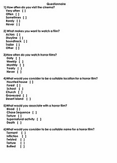
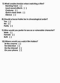
We wanted to fond out what people wanted in terms of a horror film, to do this we carried out a questionnaire and got 50 people to complete them, below is what the questionnaire looks like:


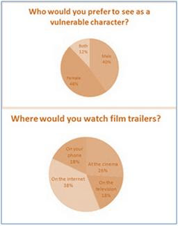
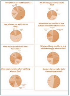
After collecting and analysing all the data, i decided to show the results by using pie charts. I feel this is a very clear and efficient way to show the results as it shows which criteria is most liked in a very easy to read format. Such as the title of the film, which is going to be 'Infliction'


Sunday 14 November 2010

Analysis one

Before we started to film our trailer, i wanted to know exactly what a horror trailer is and also find some already existing trailers.

'Horror movies deliver thrills as well as telling us stories of the dark, forbidden side of life (and death). They also provide a revealing mirror image of the anxieties of their time.'

I got this information from the following website which provides lots of intresting history about horror films http://www.horrorfilmhistory.com/

The first triler i analysed was called 'The Summer House'


Mise-en-scene

Initially we see two cars driving down a road, one is bright and the other is darker, and maybe not part of the group? We then cut to a group of friends playing in a lake. This is the equilibrium of the piece. The equilibriam is very short in a horror trailer as it should mainlt be about scarying the audience, not showing the safety and happiness on the screen. We then see a girl in a red/orange top wich has connotaions of danger. The light then hits the screen and all seems well. After the first flash card the trailer gets darker, implying danger. When we see the road sine on the floor there is a bright flash, this is almost the turning point in the trailer from equilibrium to disequilibrium. Now every shot is darker and faster, making the audience feel more tense and on edge.

Sound

Withtin this trailer the sound plays a vital role. It starts of quite happy and almost cautios. the song has a very eary feel to it and is almost haunting. The fact that the sign on the floor warning them is not seen is even more implied by the sound effect added on the top. The song starts to build speed and get more intense as the camera shots speed up. As a flash card appears saying 'survive' intense drums start, making the audience evn more nervous. The haunting sound and singing stop and the music is very intense with sound effects corresponding to the shots. This builds to a climax which stops when the name of the film appears (The Summer House) and then holds on another eary and haunting climax until the trailer ends.

Camera angle shot and movement

The beggining of the trailer has a ixture of shots from close ups to extreme long shots. The length of the shots are between two and five seconds long which is resonably long, showing a sense of safety. At the point of view shot in the lake we can see that the girl is by herself looking at her friends at the edge of the lake. We then see the car in the backround and a sign in the forgorund. We know that this is there car because we have preiously seen it in the establishing shot of the trailer. The sign is quite easy to read and the 'NO' is in red which has connotations of denger. After we see a close up of knives and what appears to be a face, the shts speed up dramatically and consist of a mixture of extreme close ups and extreme long shots. This fast cutting makes the audince feel more tense and edgy.

Editing

The editing withtin this piece is very important. Like the previous two technical codes it starts of reseonably slow but speeds up as we reach disequilibrium. The flash cards are very influential into the tension building within this trailer. We see more flash cards as the editing speeds up. Within the trailer there are many blend edits which give fluidity to he piece.

Monday 4 October 2010

Responsibilities

The responsibilities of the group will be spread out equally between the four of us to ensure that we all do the work required to create a strong final product. The responsibilities are as follows:


Me - I will be taking part in the acting, the props and also the locations


Jennifer - Continuity and directing


Laura - Acting, costume, and make-up


Chloe - Filming and lighting


However, since the editing of the trailer is such a big job, it would be unfair for one person to have all of the responsibility. This is the reason we have a shared role in the editing of the film.

We feel that the responsibilities have been shared out equally, giving each of us a strong individual role within the production of the horror trailer.

Monday 27 September 2010

A2 Media Proposal

For my year 13 practical work i have decided to film a horror trailer. The group i am working with consists of three other people: Chloe Edwards, Jennifer Buck and Laura Robinson. As a group we will film a horror trailer for a maximum length of two and a half minutes. Each person will have their own responsibilities in the creation of the trailer, these will be shown at a later date in another post.

Individually i will create a poster to advertise the film and also a magazine cover.

A2 Media Studies

Monday 10 May 2010

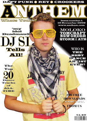
This is a copy of my finished front cover.

As you can see I have added another hook on the right hand side and also edited the contrast and brightness to make the picture look better. I also changed the size and placement of the main image because I was not fully satisfied with the orientation of the original.
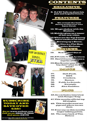
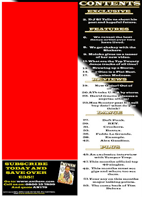
This is my finished contents page.

All of the pictures have been placed on a white background with a drop shadow to give them a photographic look. The photos are also angled slightly which gives the contents a slang feel which relates with the reader more directly. The page numbers in the corner of each picture vary from black to white, depending on the colour of the picture.
This is my finished main article page which is A3 sized

I finished cutting out the main image and moved it around until I was happy with the position.I then adjusted the contrast and brightness of the image to make it look stronger and warmer. I then added a box in the corner to show the reader what the page consists of. I added two images of DJ SI with friends and at work on the bottom right of the double page spread. I also added a quote from the article in the centre of all the text, a common convention of magazines.
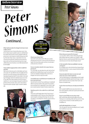
This is the finished second part to my article.

I added three more pictures with white backgrounds and drop shadows to make them look like photographs and give the article a relaxed feel. The advert is in the same style as the one on the contents page which shows continuity throughout the magazine. I also added a 'Continued...' to make the reader even more aware that this is a follow up page

This video shows some audience feedback which i filmed in order to show what the public, who would possibly buy the magazine, think of my product.

Thursday 25 March 2010

Here are the flat plans of the front cover, contents and both article pages. I drew them before creating my magazine to give me a feel of how it would look and if the layout would work.

Front Cover


Contents


Article (first page in A3)


Article (second page)

Monday 15 March 2010

Advanced Subsdidary GCE Media: Evaluation for Foundation Project

The task for the final project was to create a front cover, contents and article of a music magazine in the genre of whatever our research showed was wanted. For my foundation media project I decided to work alone. By working alone I was able to learn and develop new skills in Photoshop.

In what ways does your media product use, develop or challenge forms and conventions of real media products?
By carrying out research into real magazines such as ‘Vibe’ and ‘Rock Sound’, I discovered many basic conventions of music magazines.

The most common age group which is targeted by music magazines is from 15 to 26 and is usually aimed at the male gender because they seam to be more musically orientated. This is the reason I decided to choose this age group when developing my magazine.

By looking at existing magazines, such as the well-known magazine ‘Vibe’, I discovered many of the conventions of music magazines. These are annotated around the magazine below: By carrying out this research I was able to use many of the conventions of existing, popular magazines in my music magazine. For example, the vibe magazine uses only four colours: red, gray, white and black. It also has the model in front of the title, has a menu bar across the top with artists who are featured in the magazine, catchy hooks, large attractive writing, and a clear presentation. I decided to use these conventions in my magazine, by using only three colours; black, white and yellow, the magazine is similar to already existing products. This basic colour scheme will help the buyer recognise it for any future purchases.

The other magazine I analysed was ‘Rock Sound’ a music magazine for the rock enthusiast. Rock sound is a less well known magazine so does not feature a well known artist like Vibe did. The magazine cover uses over five fonts and four different text colours making it look anarchic and vibrant to attract the younger audiences. The title on this magazine is above the artists featured. This gives the impression that the magazine is not as well known as Vibe or that the models are awkwardly expressed showing their want to get closer to the reader.

The almost hand written text gives the magazine a personal, schoolboy graffiti look, which will appeal to the younger audience. This hand written style relates to rebellious punk style of the magazine which was often hand written and photocopied before being sold.
By dressing the model in a yellow top, which stands out from the background, it automatically draws attention to him. By wearing yellow glasses it gives the feel of fun and excitement to the cover. The glasses also represent dance music because they are seen and associated with nights and events and often worn as in parties and music festivals. By wearing a top featuring an already famous artist but, having it slightly covered by a scarf, it implies that the audience should be able to connect to the model, by feeling that they like the same type of thing, in this case ‘run dmc’.

This magazine contents page is associated with 14-24 year olds. It is a British magazine and is published by IPC Media. The contents page itself consists of a busy but organised layout.
Flowing down the left hand side is a feature, showing you if your favourite artist in the magazine, helping you to buy it. The right hand side consists of sub headings which are relevant to the stories below them. The title is short, large and simple. It attracts the reader and tells them that the data is recent by saying ‘this week’. Towards the bottom there is a small advertisement offering a bundle pack of NME magazines in order to save money.

The colour scheme is simple and consists of a theme of three colours, red white and black. Theses colours are used in the main part of the contents, for things like sub headings and hooks. The advertisement towards the bottom of the contents uses a different colour scheme, to attract the attention of the buyer in the hope that they will buy the product being advertised.

This magazine contents page helped me to style my contents. Similar to this contents, I have put an advertisement towards the bottom of the page, offering the reader to save money if they subscribe.

The article headings and sub headings down the right hand side helped me to design the right hand side of my page, with a few changes from other influences.

The Mojo contents page helped to give a better understanding of the layout I would use for my contents. I decided to take the best out of both the NME contents and the Mojo contents. I used the basic layout of the Mojo contents but replaced the three pictures with an advertisement. Instead of the articles stopping where the pictures stopped I decided to continue them all the way to the bottom of the page. Also, the pictures on my contents page contain numbers which directly link them to the article or feature on the side of the page.

The Mojo magazine has a much older of 30-55, which is much older then my magazine. The audience is older because most of the artists featured are much older and in their 60s. However, some of the artists appear to be in there 20’s which could also attract a slightly younger audience.
The first feature article I analysed was the article in heat magazine. Heat magazine is popular in the U.K and is published by Bauer. The article is about June Sarpong, a well known T.V presenter who has hosted T4 for 9 years.

The article has a simple but effective layout and uses a very basic colour scheme, red, yellow, black and white. The main body of text is in black and contains bold sections where a question is being asked during the interview, this is a common feature of a question and answer article.

Just under the title there is a brief and catchy line, placed there to attract the reader’s attention to the article and make them intrigued and want to read on.

This article, however, is only a single page article, which is no good as I am required to design a double page article. The basic conventions within the article can be used. Like the placement and type of pictures used.
I decided to use this double page article as the style model for my article. I decided to do this because the lay out is simple and intriguing, the colour scheme is very simple and there is a full page dedicated to the model.

How does your Media Product Represent Social Groups?
My magazine is aimed at dance enthusiasts of the middle to late teens, generally 15-25 years old but it is not exclusive to this age group so it can be read by persons outside of the age category, this will also increase sales. The age of my model represents the target audience, he is a dance enthusiast himself but he also fits into the target age group, encouraging young people to buy the magazine. The model is shown in a positive light and also represents the young working class who would but the magazine. My magazine is aimed at persons who are of the working class or on a tight budget. The price of the magazine is also important, if a young person is on an allowance they should still be able to afford to buy it once a month because it is priced at only £1.49.

My article is very inspirational to any young person. It gives them hope and inspiration and shows that anything is possible. It shows the DJ in a very positive light and sends the message ‘fight on’ because of what has happened to him.

What Kind of Media Institution Might Describe your Media Product and Why?
The most likely group to publish a magazine such as ‘Anthem’ would be the Bauer group. The Bauer group is Europe’s largest privately owned publishing group, it offers over 230 magazines in 15 countries, making it a good group for my magazine because it would receive more recognition in more countries. More information about the Bauer group by visiting the following website -http://www.bauermedia.co.uk/about.

Although Bauer is Europe’s largest privately owned publishing group, it publishes none of the magazine covers I analysed. It does however, publish ‘Mojo’ and ‘Heat’ which I used as style models for my contents page and also for my article.

If Bauer did take on my magazine I would be filling a gap in their market, increasing profit margins. The music which Bauer currently sells is hard rock/metal in the Kerrang magazine and in Q and Mojo there is heart soul and passion for music and access to behind the scenes, but no dance music. This leaves a potential gap for the Bauer market. The age of the audience for Q is 20-35, and Mojo is 30-55, meaning that there is a certain gap for music magazines with a younger audience, such as mine. Q is becoming more of a lifestyle magazine which means there is a gap for a stronger musically orientated magazine. So my magazine would introduce a new genre of music to the Bauer Media Company, along with a younger audience.

Who would be the audience for your media product?
The ideal audience for my magazine would be male and aged between 15 and 25 and be of working class on a disposable allowance and also go to music events, music nights and also download music. The magazine is relatively cheap so it would be able to be afforded by those on a tight allowance. The magazine is aimed at males but it would not be looked down upon if a female chose to buy and read it. A person who was possibly on National Minimum Wage or just over and working in a part time job would be most likely to buy my magazine because they could afford to buy it monthly without to much of a squeeze on there allowance.

As my magazine is a monthly magazine it features many different artists and stories to try and encourage sales every month.
Audience Feedback
Name: Greg Midwood
Age: 19
Occupation: Full time student with a part time job as a waiter
Monthly income: About £200 - £250 (excluding tips)

Greg told me that he has to be tight with his money. As he is on a tight budget he has to watch what he spends his money on. As he is a music lover however, he often spends money downloading music or going to gigs, he told me that he spends around £20 - £50 a month on music related items.

He told me that my magazine would attract him and also that the price is affordable for him.

How did you attract/address your audience?
When you look at a magazine, the first thing you see is the title page, and most importantly the model on the title page along with the title and the colours. That is the reason in which I placed a bright, attractive and intriguing image onto the front page at a medium shot which is not to close or to far from the audience. The title is large and bold so is easy to read from a distance, i.e. if somebody was far away from the magazine stand. The model is standing in front of the title which is a common convention used in music magazines. The model is of a similar age to the audience and is wearing similar clothes to them. The model is young so will have a close bond to the reader, making them feel closer to him. As he is popular it will make them want to aspire to be like him because his life may reflect yours, this would become clear after the buyer had read the feature article. The front cover also uses very basic black and white colours which have a golden/yellow stroke which matches the models yellow top.

I attracted my audience by carrying out a close analysis of existing products like VIBE. This allowed me to develop my magazine carefully. For example, the hooks on my front cover invite the audience to take part by entering competitions and having there say, giving them a feel of ownership.

The choices which people make are motivated by the desire to satisfy (or gratify) their range of needs. The following website contains a video which states the uses of gratifications in the media world: http://www.slideshare.net/dphillips4363/use-and-gratification-model. Out of the four areas covered by the uses and gratifications theory, my magazine covers two of them. They are:
Personal Identity: This is relevant because my magazine helps to explore and reinforce the reader’s value by showing the central model in a positive light, in which they can compare themselves with.
Surveillance: This is also relevant because the reader is satisfying their needs to receive constant information about what is happening in the world.

Another way I attract my audience is by using colloquial language and also information in which the audience can relate to in my article ‘I actually went out clubbing’ by using this audience, who are young, can more easily relate to the artist.

The use of competitions to get the buyer involved in the magazine gives them a sense of ownership towards the magazine. I discovered this by carrying out lots of research into other magazines, like Vibe. My magazine shows personal identity when compared to the ‘uses and gratifications theory’. The readers explore and re-enforce their own values through comparison with the main model.

By carrying out a questionnaire I was able to find out many things in which dance music enthusiasts look for in a magazine. It showed me that the ideal target group is 15-25 and that it would be best priced below £1.50. It helped me to deter which title would work best and also what attracted them to a magazine. Along with other types of research my questionnaire was the backbone to my development of my magazine.

What have you learnt About New Technologies from the Process of Creating this Product?
Before creating this product, I did not know much at all about media and the software and equipment which came with it. Now, however, I can successfully and confidently assemble and disassemble a tripod and also use it to take good quality photographs. I can fully control a digital camera and use it with many functions. My computing has developed greatly, especially in the creating of a blog and also by the use of Photoshop. I have gone from being a consumer of a media product to a producer of my own product with a world wide internet audience who have the opportunity to give me feedback, may it be positive or negative.

I can also say that I can manipulate images successfully, like my front cover. I manipulated this image by increasing the brightness and contrast of the image to make it look brighter and more attractive. In my article, the model looked slightly yellow. To improve the colour I simply reduced the amount of yellow within the image.
Looking back at your Preliminary Task, what do you feel you have learnt in the Progression from it to the Final Product?
Previous to my preliminary task, I could barely spell Photoshop never mind use it. Now though I can comfortable navigate my way around Photoshop and use it to a good standard. The amount of practical skills I have developed is massive. I have learnt how to change contrast and brightness of photos, like my front cover image and also my main image in the article. I developed my skills with the help of others but it was mainly through experimental error, this made me become much more confident on Photoshop.


As you can see, since the preliminary task (above left), my photoshop skills have developed which have made my music magazine (above right) look much more professional then the school magazine.

Since doing my preliminary task, I have learnt how to target an audience and play to their desires to create a product liked and loved by them. This was mainly done through research, which I also improved on since my preliminary work.

I can now confidently crop photos, add effects to text and change settings within the text layer, such as adding a drop shadow or emboss. The work I produced in my preliminary task was the first piece of work I had ever produced in Photoshop. At the time I thought it was good but looking back at it now, with a greater knowledge of Photoshop, I am disappointed with the quality of it.

During the course of creating my media product, I have learned the basic conventions of magazines and also how to analyze them. Along with that I have learnt the theories which helped to shape the current magazines we have now.

I have created a magazine that can compete in a realistic market against leading magazines such as VIBE and Kerrang.

Monday 1 March 2010

As i had a lot of article left, i decided to make another page, this is the first draft. As you can see i have used the same text: font, size, colour and styling to give the whole article more fluidity.
I also added the box to the right hand corner, the same as the first page. This also tells the reader that it is the same interview.
I then added an image to my article which is very similar to the one in 'Look'. I also started to cut around the image.
After putting on bold text i decided that it was to in your face for an article to I changed it to a smaller and nicer text with bold writing for each question, another common convention of articles. I also made the first letter of the text larger then any other writing in the article to emphasise the start of the text. I also added a main quote from the article as the title which is a common convention used in magazines.
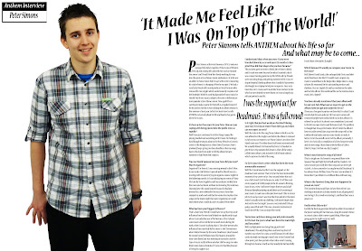
I began by creating a double page spread and inserting the article in a bold text. I based by feature article on the article I analysed from the 'Look' magazine which is about a music artist. I used the basic convention of using columns to lay out my article because they are in all of the magazines i analysed and it is easier to read.


Here is a copy of my interview that can be seen above.
Peter Simons, otherwise known as DJ SI, is not your average Disk Jockey. Aged just 19 he is one of Britain’s best up and coming DJ’s and with hits such as ‘Around the corner’ and ‘Proud Point’ he’s slowly working his way into the open arms of dance music enthusiasts. At 16 he was an addict to house music but he says with as he is maturing, his style of music is changing. When he was just 17 he had a very lucky break with record producer David Samson who released his two singles which, unfortunately, stayed out of the limelight. With his early background of house music he should find it very easy to adapt to the ever so different yet more popular style of dance music. Now aged 19 he is starting to make a name for himself as a regular house DJ for his uncles club, he is even talking of an album release in the summer of next year. In his first interview, he tells ANTHEM exclusively about his life and how he has got to where he is now...
It’s been a fast few years for your Peter.
How are you coping with being placed into the public view so rapidly?
Well I have just continued to do the things I enjoy, like playing football and socialising with friends. I’m finding it hard though trying to adapt to the busy lifestyle of a music artist it’s like being back at school. David [Samson, Peter’s producer] keeps giving me these deadlines that my songs have to be done by in order to fill the album for next summer, its hard work but I enjoy it.

You met David Samson last year, how did you meet? Was it organised?
Organised? Far from it. I was messing around in the DJ box in my uncles club before it opened and he [David] was in a meeting with my uncle trying to organise a dance night for the following month. As I started playing my remix of ‘Show Me Love’ by Steve Angelo he and my uncle just strolled into the room and sat down, without me knowing. My uncle was showing Dave the sound system because he had just invested in a new subwoofer for extra base. Dave then stopped my uncle and said that he wanted me to play a few songs on the music night they were organising so I could show them what I could do, and it escalated from there.

Who has been your biggest influence?
That’s a hard one. Overall I would have to say that my uncle influenced me the most and helped me significantly to get where I am today because of his business. After I played some music at his club he let me work more during the week, when I wasn’t studying that is. The other person who influenced me massively by his music is Joel Zimmerman who is better known by the name Deadmau5 (dead mouse). He created some brilliant music like ‘Arguru’ around the time I met David and was working in my uncles club. His type of music really influenced what I did to songs to make them more dance orientated. I have even had the pleasure of being his support act.

I understand that, when you were 17, you were knocked down by a car and spent 12 months in hospital. How did that shape who you have became?
The accident gave me time to think, lots of time to think, and it made me more focussed on what I wanted to do. It was a major turning point in my life. Whilst all my friends were out doing drugs and getting nowhere in life, I was sitting in hospital, thinking about what I could do. My parents also bought me a laptop to help me recuperate. I was very inventive on it, I even used it to do the ‘Show me love’ remix which in turn helped me meet David, so it was a hugely significant period in my life.

What made you make the change from house music to dance music?
I feel that house music is heavier than dance music. If you listen to house you are usually at a party or a club but dance has a wider variety. By that I mean it is played in clubs and parties but it is also listened to it whilst driving or just chilling. I listened to Dance music so much when I was I was recovering in hospital and I decided from that point that dance music was they way forward, don’t get me wrong I still love house music but dance is more liked and preferred by more people.

Is it right that just last week you finished filming your vary first music video? How did it go and when can we expect to see it?
Well the video is for the song ‘Many Colours’ which is on the new album but the single is out before the album is released in July so you can expect to see ‘Many Colours’ any time after March next year. The video shoot itself went extremely well. We actually filmed it in Hamsterley forest, in Teesdale to give it that crisp autumn feel about it. After all the song is called many colours, and autumn is full of many colours, which captures the feel of the song.

So far in your short career, what has been the most memorable moment?
Well, like I mentioned earlier I was the support act for deadmau5 last summer. That is by far the most memorable moment of my career so far; I was on just before him so it was a full crowd, 13,678 to be precise, only 322 off the maximum capacity of 14,000 people in the 02-arena In Birmingham. It was a view I will never forget; thirteen and a half thousand people jumping up and down and screaming at your music, it made me realize just how much I like to do my job. As it was last year I was 18 at the time and after the show ended I actually went out clubbing. I will never forget what Joel said to me that night, “you are a very talented DJ, keep going, you will do well”. This was a massive motivation; it made me feel like I was on top of the world.

You’ve have only been doing your job professionally for the last few years; what have been the main high and low points?
Well, my high point was doing that gig with Joel (deadmau5). The only thing that could ever top that is if maybe I was where he is now, a world famous DJ with thousands of people turning up to watch me. So far I haven’t had a low point, just slow periods where ideas aren’t running through my head as clearly as they usually do, but hopefully I won’t have a low point. [Laughs]

Which famous DJ would you compare your music to the most?
Well, there’s David Guetta, the unforgettable Tiesto and obviously Deadmau5. But the DJ I would most compare my music to would have to be Judge Jules. Judge Jules is a magnificent DJ, renowned for his outstanding remixes and rhythms. He is an English DJ and has worked on the radio and in clubs all over the world and like me he remixes dance music, he’s a legend!

You have already mentioned that your album will be out next July. What can we expect to get on the album, have you got any surprises for us?
There are a few good surprises on there but I’m afraid I can’t reveal what they are quite yet. All I can say is some well renowned people have worked with me on this album. I’m relieved to say that it is almost near completion; I just need to finish two more tracks and the bonus track. The problem is though that I’m a perfectionist. After I finish the album I have set aside several days to go over the songs with a fine toothcomb and make any necessary tweaks to make it better. As for the overall content of the album, personally, I love it. It is basically a compilation of all my favourite work and the new songs I have done with the likes of Calvin [Harris]. Oops, I let that one slip. [Laughs]

What is your favourite song of all time?
That’s a tough one. My favourite song would have to be (pauses) ‘Day and Night by Kid Cudi and the Crookers. For some reason I just really love that song and can never get sick of it. A close contender is a song by my idol ‘Deadmau5’ it has always been a brilliant tune. The one I am on about is ‘I Remember’ I just think it is a brilliant Ibiza chill out Song.

What is the funniest thing that ever happened to you at an event?
The funniest thing would have to have been when I was working in my uncles club last month. It was all going well, I was loving it, the crowd were loving it, and then there was a power cut.
Really, what did you do?
Luckily the back up generator kicked in within 30 seconds of the power cutting off, but that was a long 30 seconds. Silence in a music dance club is never a good thing. When I got going again the night went very well.
If you could do a gig anywhere, where would it be and why?
Well, I went to Ibiza last year for a ‘lad’s holiday’ and I loved every aspect of it, especially the music. One night went into ‘Amnesia’, it was truly amazing, just the thrill of the music thumping through your body. It’s indescribable. To be standing in the biggest club in the world dancing to music I love. If I was able to be of that standard in the next few years I would love it. I can’t even imagine how good it would feel to perform in Ibiza, the dance music centre of the world, in front of thousands of people a night, it would be unbelievable.

What do you think of MC’s?
Ergh, I don’t see the point in them! Why ruin a song by shouting over the top of it? I mean we all do it but only for a laugh, I don’t know how people can listen to it and enjoy it at the same time, it’s bizarre?

Do you remember what the first song is that you purchased?
Yes, I do actually. I was only about nine and I and my friend paid half each for Bobby Browns song ‘Two Can Play That Game’. We completely overplayed it but at the time we thought it was the best song in the world

Where do you see yourself in five years?
I can’t say where I will be or what I will be doing, but hopefully I will have had some number ones! [Laughs]. I really hope that I become a world renowned DJ like Tiesto or David Guetta but you never know what will happen do you?

If you did become a world famous DJ, would you still live in the North East?
I love the North East but if I was world famous I would probably live my dream and live in Ibiza and DJ. The weather is just too cold and wet in England but if I was in Ibiza I could just sit outside anytime I wanted. You have to plan it here.

Would you prefer to be a radio DJ or a club DJ and why?
I have never really thought about it but if I had a choice I would probably say club D.J because of the feeling of thousands of people screaming and shouting; that sort of an atmosphere is something that cannot be created or felt in a radio studio.

Is there any advice that you would give to any up coming DJ’s?
Yes, I would just say to stick with what there doing and keep looking for that break. As soon as you get a break you will be on your way to fame.

If you were given the chance to start over and choose any career, what would it be? That’s an interesting one. I would probably say that I would be a professional footballer, purely for their wages. I used to play for the district when I was about 13 but I had to stop because of a double hernia.
So does that mean that you can’t play any football at all?
Well I can play football but not at any serious level, I can have a kick around for a while but if I push myself too hard it can seriously hurt.

You are a great DJ, but can you sing a song?
Well, I can just about talk my way through an easy song ‘Chasing Cars’ or something similar. But if you ask me to sing a song, you have no chance; it would sound like you were strangling a cat.
And finally, Knight Rider or A-team?
This is the question I have been dreading the most. [Laughs]. But I would have to say A-team.
Wednesday 24 February 2010

I then added some pictures in place of the red square, where they were meant to be. The pictures add more colour and more life to my contents page.
I then added a few more titles to fill the page and also an advertisement. The influence for my advertisement came from one of the contents i analysed. The advertisement also brings more colour to my contents.
I then created a space where i would put the pictures to associate with the headings flowing down the right hand side. I placed this here to ensure that i did not right on that side of the page. The heading on the right hand side are all lined up,i done this by moving them around with the grid on.
Firstly i created the background of my contents page. To allow it to be associated with the front cover i decided to create an identical background and also use the same styling of wording along with the same font.