Tuesday, 10 May 2011
Wednesday, 4 May 2011
How did you use media technologies in the construction and research, planning and evaluation stages?
The above video is over 30 minutes long which means it is very big in size. As blogger only allows certain size videos to be uploaded we had to have the video reduced in size in order to show all of the quality in the video. The downside to this is that the sound, as well as visual quality of the video has been reduced. This is the reason in which the sound is slightly off.
The origional larger sized film which is of much better quality can be found by following the link below
http://www.youtube.com/watch?v=BN36zp0ao4U&feature=channel_video_title
What have you learned from your audience feedback?
Overall we received very positive responses from the audience and took onboard what they had to say. The main thing that needed changed was the last shot which was too long. As well as this a majority of people said that it would be better if the sound had ended before the final text cards. So I went back the raw product and shortened the final shot and fade the music out slightly earlier.
Without the audience feedback none of us would have thought to do this, but in carrying out the modifications suggested we have created a much stronger product.
Questionnaire
After handing out our questionnaires to a random sample of the target audience we took them back in and went through them to see what our findings were. Overall we found that our trailer was liked and would be seen by most of the target audience.
As well as generic questions we also gave the audience a specific question. In the pie carts below the copy of the questionnaire, pie number five represents the answer the question I asked the audience 'What do you think of the use of locations and props within the trailer'
Below is a copy of the questionnaires we handed to the audience.
Results:
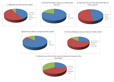 For the questionnaire we used a mixture of open and closed questions. The main reason for this was so we were able to show some findings in the form of pie charts as well as being able to receive feedback from people. As the pie charts above show, our trailer was well liked by the audience it was shown to. The open questions were very useful and the main thing we found was that the last shot could benefit from being made shorter. With this knowledge we then went back to the drawing boards to make some final adjustments.
As well as this we found out that most of the audience we asked would prefer the music to end before the final credits. We also made these adjustments to the trailer in order to further satisfy the audience.
Overall I feel that the audience feedback session went very well and help us to make some very good final adjustments to our trailer
In what ways does your media product use, develop or challenge forms and conventions of real media products?
As well as the theories mentioned above, i also found some quotes which can be related to our trailer.
John Fiske (1988) ‘attempts to structure some order into the wide range of texts and meanings that circulate in our culture for the convenience of both producers and audiences’
This quote relates the theory provided by Todarov as it relates to different stages within a piece of media, in this case the horror trailer. And as i have shown above our trailer does not follow the conventional steps to a trailer, but it does include them. This enables the audience to understand the media text but at the same time as being slightly confused
How effective is the combination of your main product and ancillary tasks?
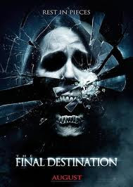
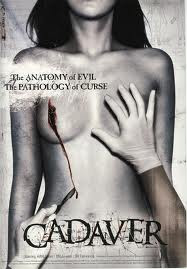
The main product can be shown in a variety of places on the internet, but the poster and magazine will be able to be seen in shops, on billboards, on bus stops, in shop windows, on trains (below) as well as being able to be found on the internet. The wider audience reached by creating print work pieces which are directly linked to the trailer maximises the possible audience by showing them a glimpse of the film without them necessarily having to be in the cinema or online.
The main product, however, is able to be shown on a multiplicity of websites which will give it a much larger audience who are able to comment and give feedback to the product itself. Websites that it could be featured on include ‘bloodydisgusting.com’ ‘YouTube’ as well as social networking sites such as Facebook and Myspace (below).


This type of advertising is called viral marketing and is a great way of advertising out final piece, especially because the target age group is 15-25. This means that most of them will have access to the internet, probably on more than one level, be it computer, laptop, mobile phone or iPod. Viral marketing is a very cheap way to advertise and, as we have no budget, it would suit our film well. The best example of viral marketing is ‘Paranormal Activity’ (below) which was involved in a massive advertising campaign in which people had to vote where the film was shown, giving the audience a very good sense of false ownership.

The main thing about being able to use a variety of websites is the fact that I have combined the process of ‘producing’ and ‘consuming’ in order to become a prosumer. This has gave me many advantages but the main one is me being able to produce a product at the same time as enjoying already existing ones, which also aided in production
By using the production name ‘Lionsgate’ we are already implying that the product will be of good quality. The main reason for this is because ‘Lionsgate’ is a reputable and international production company which is known by the consumer for being a good independent company. They have produced things such as the Saw sage and Hostel
Wednesday, 13 April 2011
EVALUATION
Final Piece
Here is the copy of our final piece which can also be found on youtube (http://www.youtube.com/watch?v=33rIAKNJpRc ) and is able to be put on other sites such as bloddydisguisting.com and social networking sites including facebook and twitter.
PLEASE NOTE: Because of the size of the movie it had to be shrank. this has caused the quality of the trailer to be effected. the main things that have been effected are the image quality as well as the sound track sounding tinny. For a better quality trailer visit the above youtube link
Ancillary Tasks
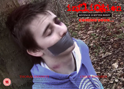
Below is a copy of my poster for which i used posters that i had previously anyalysed to gain the basic conventions of a movie poster, especially a horror poster. The previuse examples can be seen in a previuos post headed ' other horror trailers/posters'
Ancillary task one: Magazine Cover
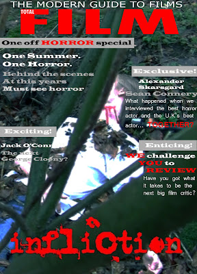
Below is a copy of my magazine cover. The poster uses the current brand name of 'Total Film' as it is a well liked and recognisable label to the film enthusiast. This product was made using conventions of magazines in which I discovered last year. As well as this I discovered more conventions of film magazines when I analysed a Total Film magazine cover, this analysis can be seen on a previous post on my blog.
As I did not need to do as much research into existing products because of knowledge obtained last year I was able to complete this magazine cover in about a week and a half. As well as this, the fact that I did not have to think of a title enabled the production time of the product to be reduced drastically.
Magazine Analysis
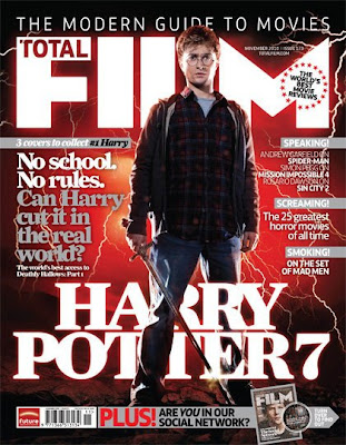
As you can see, the above magazine is focused solely on film. This is very evident because of the title of the magazine ‘Total Film’ as well as the title of a well known film on the bottom of the magazine.
As this magazine shows, the biggest title second to the heading is the name of the feature film. In this case ‘Harry Potter’. As well as this the main model on the magazine is from the main film. The main model is instantly recognisable in as a key person from the film, in this case Harry Potter. The stance is very dominant and the consumer is looking up at him.
The background is red and black which, along with the models clothing, adds to the overall mise-en-scene of the cover, giving connotations of danger in this case.
The pull lines down the sides are always film related and the biggest is always the feature article, again associated with the main film.
where we are at
Lionsgate

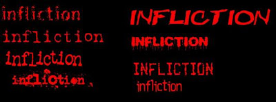
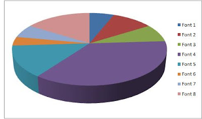
Fonts
Friday, 25 February 2011
Music
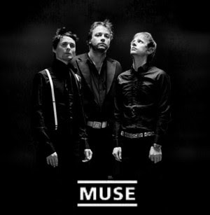 The original plan was to use two different songs for the horror trailer. We did intend to use Bill Withers - Ain't no Sunshine when she’s gone for the start of the trailer because we felt the lyrics suited to clip very well. We then intended to play Hysteria by Muse for the harsher, faster paced torture and bully section of the trailer. However this did work quite well when we tried it, upon further research I discover another song by muse whilst on YouTube. The song we will now use is called Space Dementia and fits perfectly to our trailer. At the start is very light but slightly haunting but when the bullying starts we thought it would be appropriate for the pace to pick up and it become heavier, especially as the length of shots became shorter and the trailer gets faster paced.
Tuesday, 8 February 2011
Where we are now
Monday, 24 January 2011
Outtakes
Saturday, 1 January 2011
Typical Audience
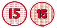
the following website contains more information on the 15 certification. http://www.screenonline.org.uk/film/id/592478/

Narrative and Representation
Most horror films are a metaphor for most of our own lives; they often identify the victim who is trying to overcome the monster. As horror is required by the human mind it is often shown across all genres of film.
Horror films also allow us to ask the ‘what if?’ and let us safely dip into our primeval fears.
The following link contains lots of interesting information about the nature of horror film - http://www.bellaonline.com/articles/art5267.asp
Storyboards
Conventions of Horror Trailers
As well as this, most good trailers are fast paced when the disequilibrium starts and often contain shots of knifes plunging or flashing on the screen and weapons being thrown. This often promises the audience blood and gore, to which most people who like horrors are attracted.
Whilst I was carrying out this research I discovered many key conventions very common in nearly all horror trailers:
· The use of the name of the producers in a text card for example ‘Fox Searchlight’.
· The use of fast shots with little or very little amounts of clarity, this is very effective and leaves the viewer in suspense, leading them to want and watch the film.
· Dark lighting is very effective as most people become nervous in the dark.
· Pathetic fallacy is often used, especially the use of rain to give a gloomy feel.
· The use of rural areas is important, in our trailer especially, because if a very urban location was used the person would not seem alone and isolated.
· Text card are often used to tell information, such as the actors name which will help to endorse the film if they are well known. However they are normally used to tell a story in separate intervals between shots.
· The use of weapons and showing of blood or gore is often popular to horror audiences.
· The use of a victim.
· The editing of the piece, especially in the disequilibrium section, is very fast and often has very few transitions, which help to make it disorganised as mentioned above.
· Many horror trailers also leave the viewer in suspense with one last scare at the end after the text cards.
Other horror trailers/posters
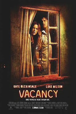 The poster for this film is very good. You simply see two people who are trapped with no way out. they are purposely framed within the window to show that they are isolated. The slight distortion to the picture also gives it a good luck, for the films genre. You can also see the reflection of the motel sign in the window, which they appear to be looking at, with a very vacant expression.
Key Points from the Trailer
- very dark lighting is used
- the diegetic sound is very whispery, especially the dialogue
- you can clearly see that the two people being focused on are lost and are filmed as being alone and in isolation
- you can clearly see a realisation of the problem when the two are watching videos of people being killed in the room they are in
- the speeds of the shots speed up at the same time as the the music, which works very well
 This poster is especially special. Normally you would associate white with purity and calm, but in this poster the two people wearing mainly white appear to be the 'bad guys' of the film. However, the name 'Funny Games' is in red which has connotations of blood and death. This poster also contains a review from a newspaper, to show that it has been highly rated.
Key Points from the Trailer
- the music starts out very happy and positive and takes conventions other areas of film which would not be associated with a thriller or a horror
- the, what we learn to be villains, are in white which is very convention breaking as the so called 'bad guys' usually dress in black as white often gives a sense of innocents
- the music also speeds up at the same time as the shot lengths decrease
- the text cards are red however which have connotations of blood, fear and also a sense of warning
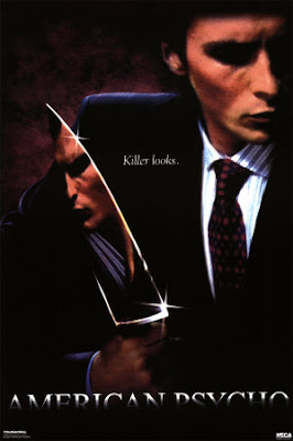
This poster is very simple and very effective. There is very little text so most of your attention is on the man within the frame. The fact that he is holding a knife instantly tells you that he is probably the person in the film who will be doing the killing. The fact that we can see his reflection in the knife tells us that he has two sides. The simplicity of putting 'killer looks.' on the poster is very effective, as it makes you wonder what it is all about.
Key Points from the Trailer
- the use of dialogue within this trailer is very minimal and is more like we intent to have our trailer
- the talking is chatty but in a happy tone, however what the man is saying is actually pretty sick
- lighting is also very dark within this trailer
- the only sound when the main piece of acting is taking place is the song, which is a happy song and does not follow what would normally be associated with a trailer
- the main villain is often wearing white but often has red blood on his face or arms which show he is the bad person within the trailer
- as well as this the text cards are white which also represent innocence
Locations
