Wednesday, 13 April 2011
EVALUATION
Final Piece
Here is the copy of our final piece which can also be found on youtube (http://www.youtube.com/watch?v=33rIAKNJpRc ) and is able to be put on other sites such as bloddydisguisting.com and social networking sites including facebook and twitter.
PLEASE NOTE: Because of the size of the movie it had to be shrank. this has caused the quality of the trailer to be effected. the main things that have been effected are the image quality as well as the sound track sounding tinny. For a better quality trailer visit the above youtube link
Ancillary Tasks
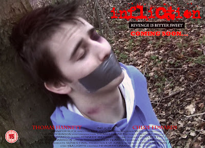
Below is a copy of my poster for which i used posters that i had previously anyalysed to gain the basic conventions of a movie poster, especially a horror poster. The previuse examples can be seen in a previuos post headed ' other horror trailers/posters'
Ancillary task one: Magazine Cover
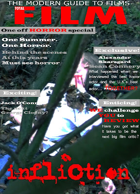
Below is a copy of my magazine cover. The poster uses the current brand name of 'Total Film' as it is a well liked and recognisable label to the film enthusiast. This product was made using conventions of magazines in which I discovered last year. As well as this I discovered more conventions of film magazines when I analysed a Total Film magazine cover, this analysis can be seen on a previous post on my blog.
As I did not need to do as much research into existing products because of knowledge obtained last year I was able to complete this magazine cover in about a week and a half. As well as this, the fact that I did not have to think of a title enabled the production time of the product to be reduced drastically.
Magazine Analysis
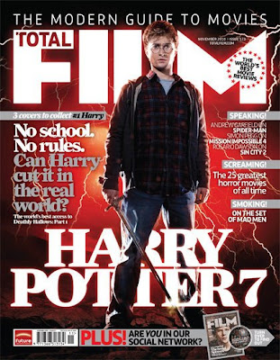
As you can see, the above magazine is focused solely on film. This is very evident because of the title of the magazine ‘Total Film’ as well as the title of a well known film on the bottom of the magazine.
As this magazine shows, the biggest title second to the heading is the name of the feature film. In this case ‘Harry Potter’. As well as this the main model on the magazine is from the main film. The main model is instantly recognisable in as a key person from the film, in this case Harry Potter. The stance is very dominant and the consumer is looking up at him.
The background is red and black which, along with the models clothing, adds to the overall mise-en-scene of the cover, giving connotations of danger in this case.
The pull lines down the sides are always film related and the biggest is always the feature article, again associated with the main film.
where we are at
Lionsgate
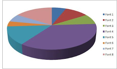
Fonts
