Monday 10 May 2010

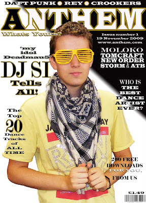
This is a copy of my finished front cover.

As you can see I have added another hook on the right hand side and also edited the contrast and brightness to make the picture look better. I also changed the size and placement of the main image because I was not fully satisfied with the orientation of the original.
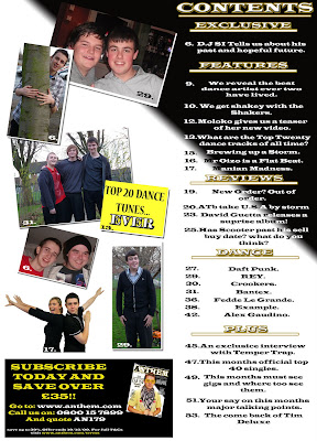
This is my finished contents page.

All of the pictures have been placed on a white background with a drop shadow to give them a photographic look. The photos are also angled slightly which gives the contents a slang feel which relates with the reader more directly. The page numbers in the corner of each picture vary from black to white, depending on the colour of the picture.
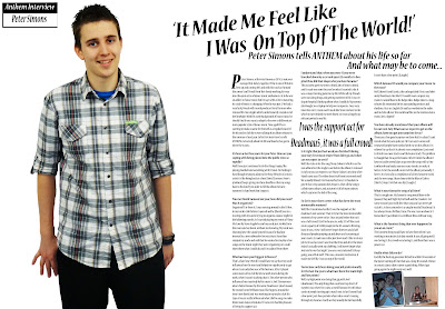
This is my finished main article page which is A3 sized

I finished cutting out the main image and moved it around until I was happy with the position.I then adjusted the contrast and brightness of the image to make it look stronger and warmer. I then added a box in the corner to show the reader what the page consists of. I added two images of DJ SI with friends and at work on the bottom right of the double page spread. I also added a quote from the article in the centre of all the text, a common convention of magazines.
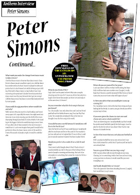
This is the finished second part to my article.

I added three more pictures with white backgrounds and drop shadows to make them look like photographs and give the article a relaxed feel. The advert is in the same style as the one on the contents page which shows continuity throughout the magazine. I also added a 'Continued...' to make the reader even more aware that this is a follow up page

This video shows some audience feedback which i filmed in order to show what the public, who would possibly buy the magazine, think of my product.